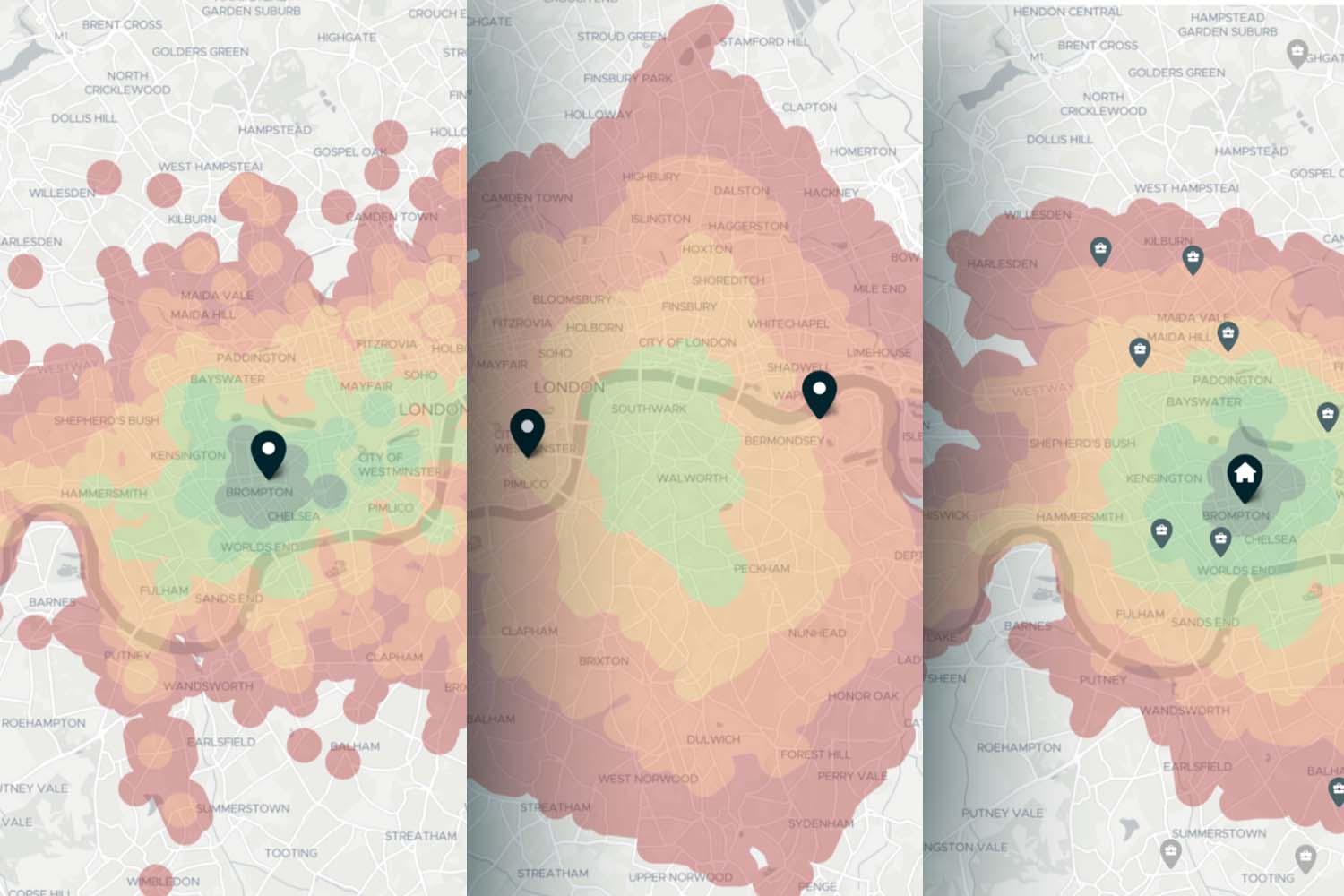
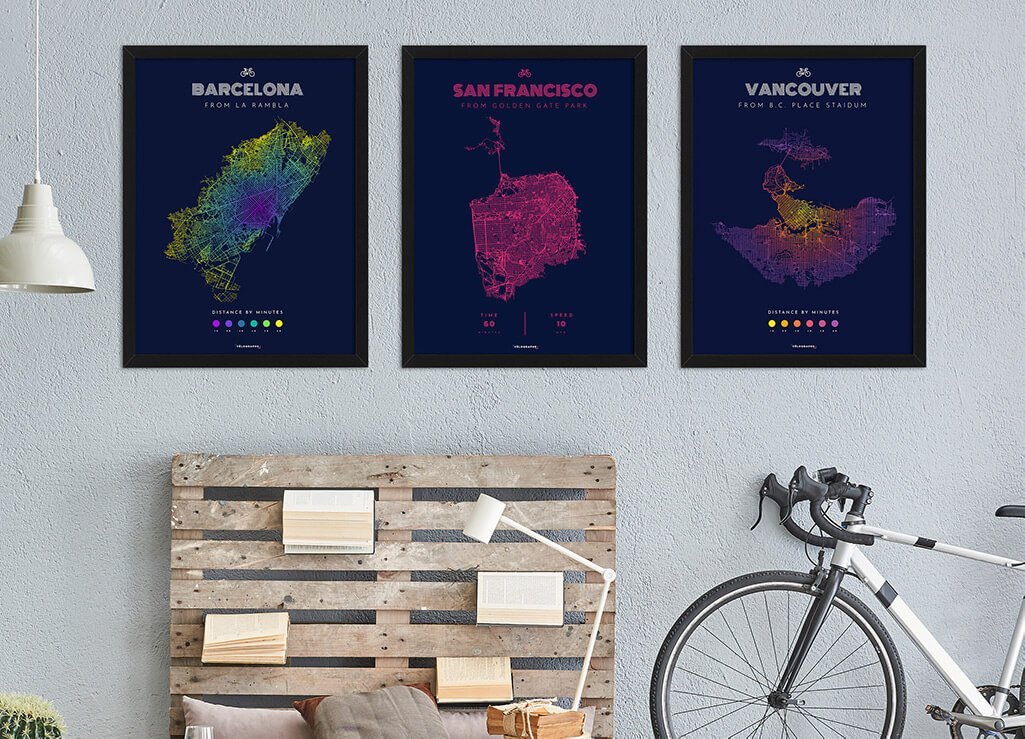
They look beautiful and can be incredibly powerful when added to interactive map applications: Isochrones. Whether you want to show which areas are within walking distance of an office building or analyze the accessibility of a school by public transportation, isochrones offer a quick and easy solution. In essence, they show how far you can travel from a certain starting point, and often the individual travel time segments are also color-coded for better clarity. Here we give a brief introduction to the different ways isochrones can be used.
Targomo offers a wide range of geospatial tools that can be used to perform powerful location-based analysis, visualize detailed statistics, and solve complex logistical problems. However, here we will focus on one of the simplest, but most useful and therefore most popular APIs: the Isochrone API. The Isochrone API is used to visualize reachable areas from a source or a group of sources as polygons.
So what is an Isochrone? Merriam-Webster defines an isochron(e) as “a line on a chart connecting points at which an event occurs simultaneously or which represents the same time or time difference.”. The shapes returned by the Isochrone API represent this by connecting all the furthest reachable points in the routing network from the given sources into a polygon. We refer to these as “reachability polygons” or “isochrones”. The definition is somewhat broader in our case, as we can visualize both time and travel distance, and also provide the ability to define multiple sources and aggregate the resulting isochrones.
This can be used in a variety of useful applications, all of which fall into one of the 3 following scenarios:
1. Simple Polygon Reachability
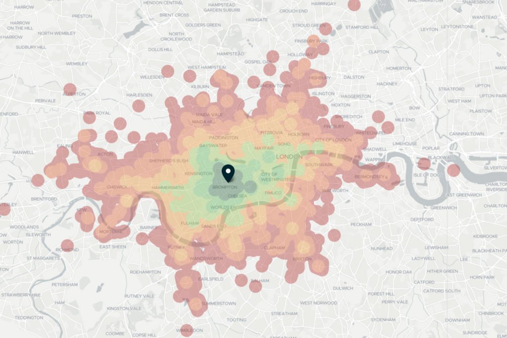
Whenever you want to intuitively visualize the areas that can be reached from a starting point within a certain travel time or distance, isochrones offer a quick, easy and relatively simple solution. You can implement them in such a way that users can choose between car, bike, e-bike, walking and public transport.
The travel mode is crucial, because the results will vary greatly. This is due to the underlying routing, which represents realistic travel scenarios: When traveling by train, your journey is largely determined by the location and number of bus and subway stops. When traveling by car, speed limits, the road network and traffic lights determine how far you can travel.
Since realistic routing always takes into account obstacles such as lakes, rivers, bays, bridges, and mountains, isochrones provide a much more accurate representation of reachable areas than a radius ever could, regardless of the mode of transportation you choose.
2. Multi-Source Polygons and Polygon Intersections
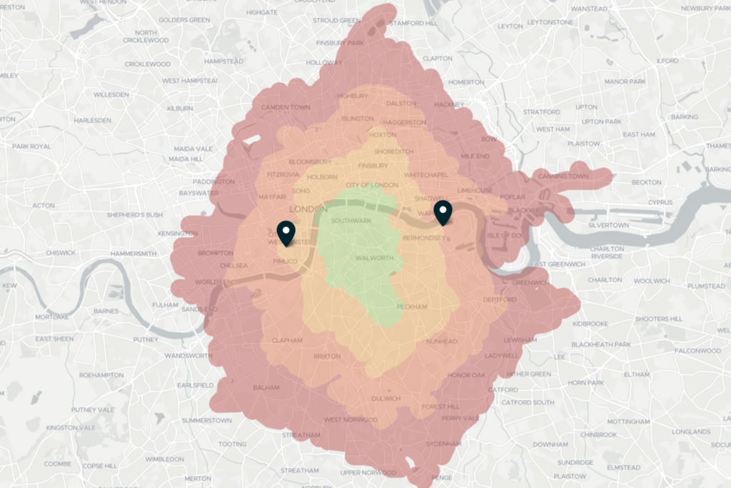
Once you start adding source locations, you can visualize and analyze much more complex reachability scenarios. One of the industries where this is becoming increasingly important is real estate search: On many real estate portals, people looking for apartments can create their individual search area based on several personal addresses (e.g., the workplace and child’s school) as well as the preferred mode of transportation. In a related use case, companies looking for new office buildings are starting to consider their employees’ addresses and commute times.
It is easy to create polygons with more than one source, and you can define how these sources interact with each other. In terms of Targomo’s Isochrone API, we distinguish between three intersection modes:
- The “Union” mode is the default, which combines all generated polygons. This is useful to find out which areas are reachable from any number of locations, e.g. the total coverage area for a collection of stores.
- The “Average” mode provides the average reachability from all sources, which is very useful for calculating the “best reachable” area from all sources. This mode can be used to easily find a suitable meeting point or to determine the best location for a supply warehouse for a group of retailers.
- The “Intersection” mode, on the other hand, shows only the area that can be reached from all sources, with the greatest distance taking precedence over all other values. This way, for example, it is possible to specify an area that is accessible from both your house and your workplace.
3. Filtering Targets Using Polygons
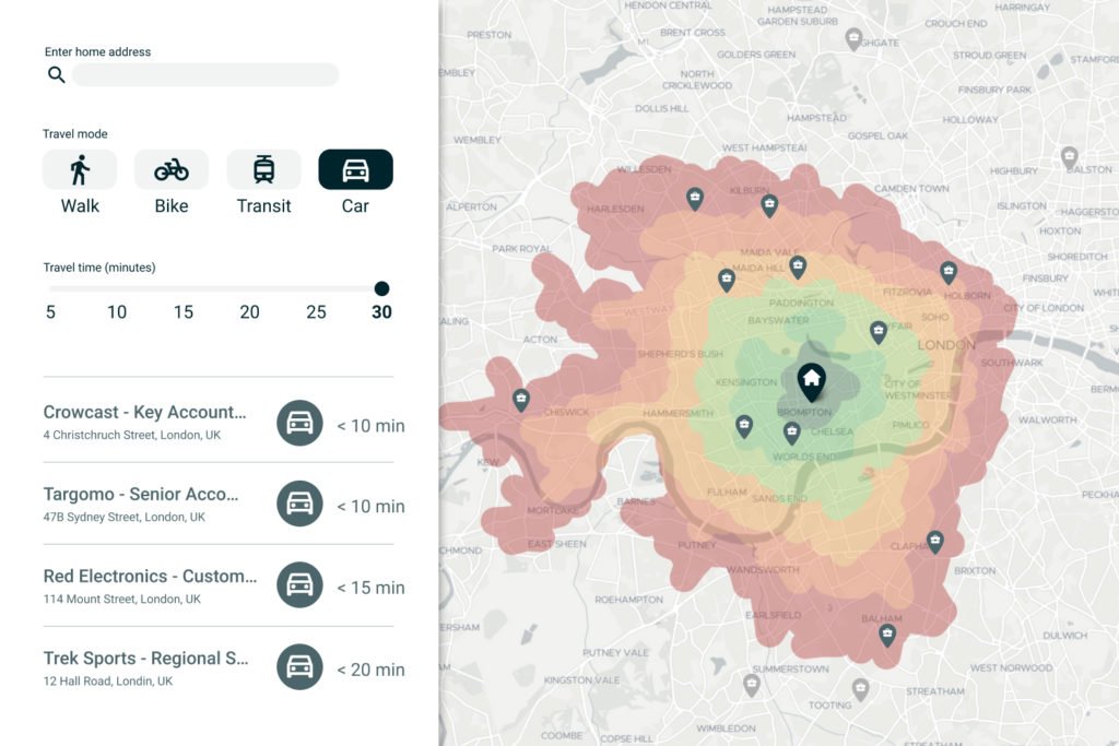
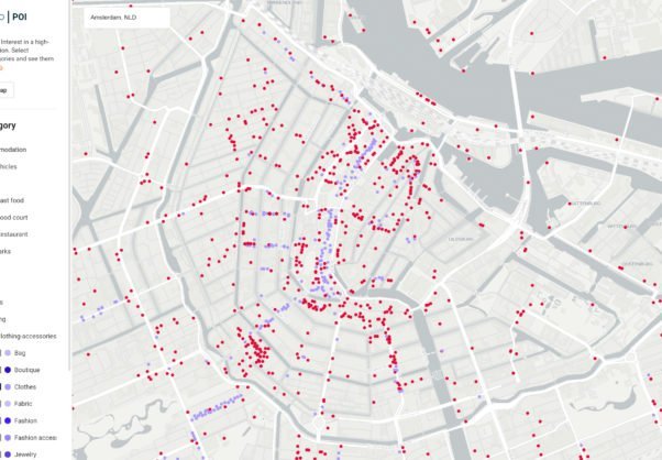
When displaying a group of locations to a user (such as a client, a business partner, or simply as part of a larger presentation), you may want to filter them by their accessibility from one or more starting locations. This is particularly useful for creating lists that take into account the user’s travel time constraints – for example, displaying workplaces that can be reached within 30 minutes by car, or vacation homes that are a 15-minute walk from the beach.
With isochrones, it is easy to display only the places that are accessible according to individual travel preferences. The algorithm only needs to check
By intersecting the point with isochrone polygons, you can determine which time-band the points are within (i.e. “< 10 minutes by car”) and sort them accordingly. This way, you can conveniently filter locations that are either 15, 30 or 45 minutes away from the source and help your users make sense of the data displayed.
If you want to display or analyze the exact accessibility of places in terms of travel time, you should check out Targomo’s Travel Times API.
Want to try yourself?
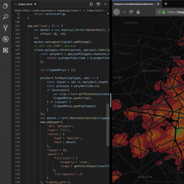
Are you interested to dive deeper into isochrone creation? Our developer Gideon Cohen created a detailed step-by-step tutorial showing you how to create your own polygon maps with JavaScript. You could also jump directly into the code in the corresponding Github Repository.

Comments